What I first of all did was open up adobe photoshop where I opened up a new document and selected the 'International paper' page size so i could access an A4 sized document.
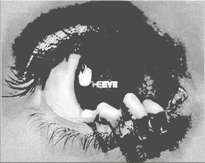
I then got a free image of an eye (due the fact our production company is called 'the eye productions') from google and copied it to photoshop so I could begin to edit it.
I then selected on 'layer' and then 'blending options' so I could begin to edit the image to give it a more shocking and better horror apeal so it could appeal to our film even more.
I first of all reduced the opacity level of the image to 49% to create a distant and unusual look/ feeling to the image.
I then maximized the opacity level of the drop shadow at a 120 degree angle, and then reduced the distance, spread and size of the drop shadow. This is what created the 'fuzzy' effect of the image which I believe adds to the grotesque nature of the image.
I then added a inner shadow to the image by decreasing the distance of the shadow and also increasing the choke and size of the shadow to create a close and entrapped look/ feel to the image which reflects the conventions of horror.
I then believed it necessary to create a outer glow to the logo to make it stand out more to audiences. This was done by maximizing the opacity and noise level of the glow, whilst slightly increasing the spread and maximizing the size of the glow. I also made sure I maximized the jitter level of the logo.
After I had finished editing the blending options of the image. I then decided to edit the color of the image even more by clicking on image and then adjustments and then black & white in order to change the color of the image to black and grey. I chose these two colors particularly because I believe they connote themes of doom and death often found in horror films.
The final thing I did was edit the Hue/ Saturation of the image as I felt to really emphasize our movies themes and the genre of the film, the image of the eye should stand out more.

As a result of all that, we came out with this image as our logo which I feel is really successful in its representation of the themes of our movie and genre of the film. As learnt in the trailer analysis film, the film production logo should indicate what your film is about, something I think this logo does very well.


No comments:
Post a Comment